NOTE: The Contextual Tabs are called Contextual because they appear in context of what you are dealing with. So with Charts you will get the Design, Layout, and Format Tabs that deal with Charts. If you are working with Pictures then you will get the Contextual Tab that deals woth Pictures.
The Easy to Create a Chart

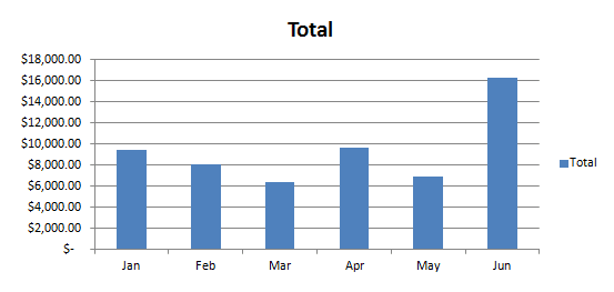
Your Chart should look like this.
Now then go ahead and Delete this Chart. I know, it is not fair, I keep having you make the Charts and then Delete them, well practice makes perfect. As they say, but who are they, I have always wondered.
This time I am going to have you create a Chart with different information in it. Select the Cell Range A5 to G13, you can do this a couple of different ways. One way is to Click into Cell A5 and then hold your Left Mouse Button down and drag to Cell G13 and then let go. Another way to do this is to Click into Cell A5 and then hold your Shift Key Down and Click into Cell G13, then release your Shift Key.
Now, you know where to go and what to do. Hey, I mean go to the Insert Tab, what were you thinking…
Once you get to the Insert Tab use the Column Button and choose the First Button in the 2D Column List called Clustered Column. Now your Chart should look like this.
This time you have a list of Items in the Legends area, the Category or Horizontal Value is not the Product Name, the Values are still in Dollar Format like the Totals. This time, however, you have several different Colors for the Months instead of just one Color as with the Totals. This way it is easier to keep the Product Totals for the Months separated and quickly readable.
I bet you know what I am going to ask you to do now, please Delete the Chart. Because it is almost time to learn the quickest way to create a chart that I know of.

![Validate my Atom 1.0 feed [Valid Atom 1.0]](valid-atom.png)
No comments:
Post a Comment